Behind the scenes: Building a personalized product demo page
 How Clearbit Uses Clearbit: This series shares how we use Clearbit products for acquisition, conversion, and operations.
Every month or so, the Clearbit Growth team joins forces to take on a "hack week" project — one week to build and launch a marketing project. It's a powerful way to move interesting experiments forward quickly, collaborate as a team, and gain useful insights for future work.
One recent hack week project taught us a lot about site personalization and how it doesn't start with data but purpose. We chose to rebuild a demo page for Clearbit Reveal, a product that provides companies with data about their website visitors that can then be used to personalize, notify, and analyze. We wanted this demo page to show and not just tell how Reveal worked, so it would be chock full of its own personalized elements. (Very meta.)
Marketers are always being admonished to personalize everything, but how do you actually put that into practice? At Clearbit, we already have great data to power personalization, but a dynamic page doesn't just materialize on its own. We needed to come up with a strategy on how to use that data to tell a story expressing why people should care.
We built that strategy by marrying qualitative insights gathered from our sales team with the very product capabilities we wanted to showcase. And it worked! We doubled the page's conversion rates and generated plenty of new pipeline for sales. Plus, we had a clearer roadmap for how to design personalized demo sites.
Here’s how we took it from start to finish, all in one week.
Why rebuild a demo page that already existed?
While we were choosing our project, one of our company-wide objectives was to increase the number of new customers using Clearbit Reveal — a reverse-IP lookup tool that lets companies see who's visiting their website. It returns firmographic data (such as industry, company location, tech stack, and more), making it possible to segment analytics and tailor sales and marketing interactions.
We'd also learned that the sales team was using a landing page from an archived marketing experiment to walk through how Reveal worked on calls with prospects. This page had personalized elements, based on basic firmographic details like a company's name, domain, and logo.
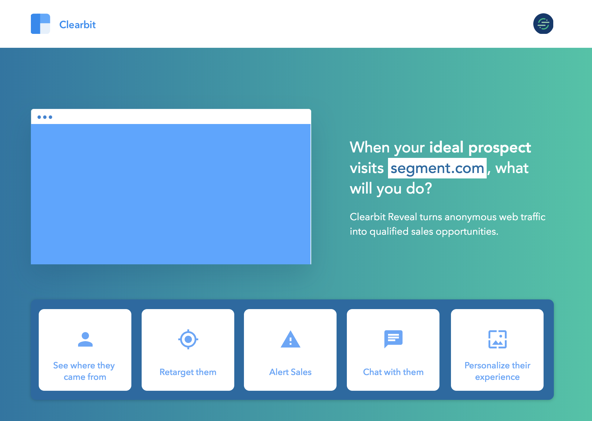 This older Reveal demo page already had some personalization, like showing the visitor's homepage URL in the headline.
Clearbit’s sales team told us that the page could use some direction. They were crafting their own pitches that told a stronger story about the product and cherry-picking bits of the page to illustrate points. Together, we felt we could provide a more cohesive frame with sharper messaging.
Given the company goal and sales needs, it was time for a refresh: a quick redesign, copy rewrite, and updated personalization examples. We decided to rebuild the Reveal page with a new story for our hack week project, not just to use as a sales resource but also a destination for paid campaigns. The sales team could test-drive it before we directed traffic towards it.
With increased sales usage and eyeballs, the goal for our project was to generate demand by doubling hand raises from the page.
Coming up with a personalization plan
We set up [an Asana project](https://blog.alexmaccaw.com/how-we-run-our-entire-company-out-of-asana) and assigned tasks to our hack week participants — [Nick](https://clearbit.com/blog/author/nick-wentz/), Julie, Brian, and me — to keep the project defined, contained, and clear. Then we got to work.
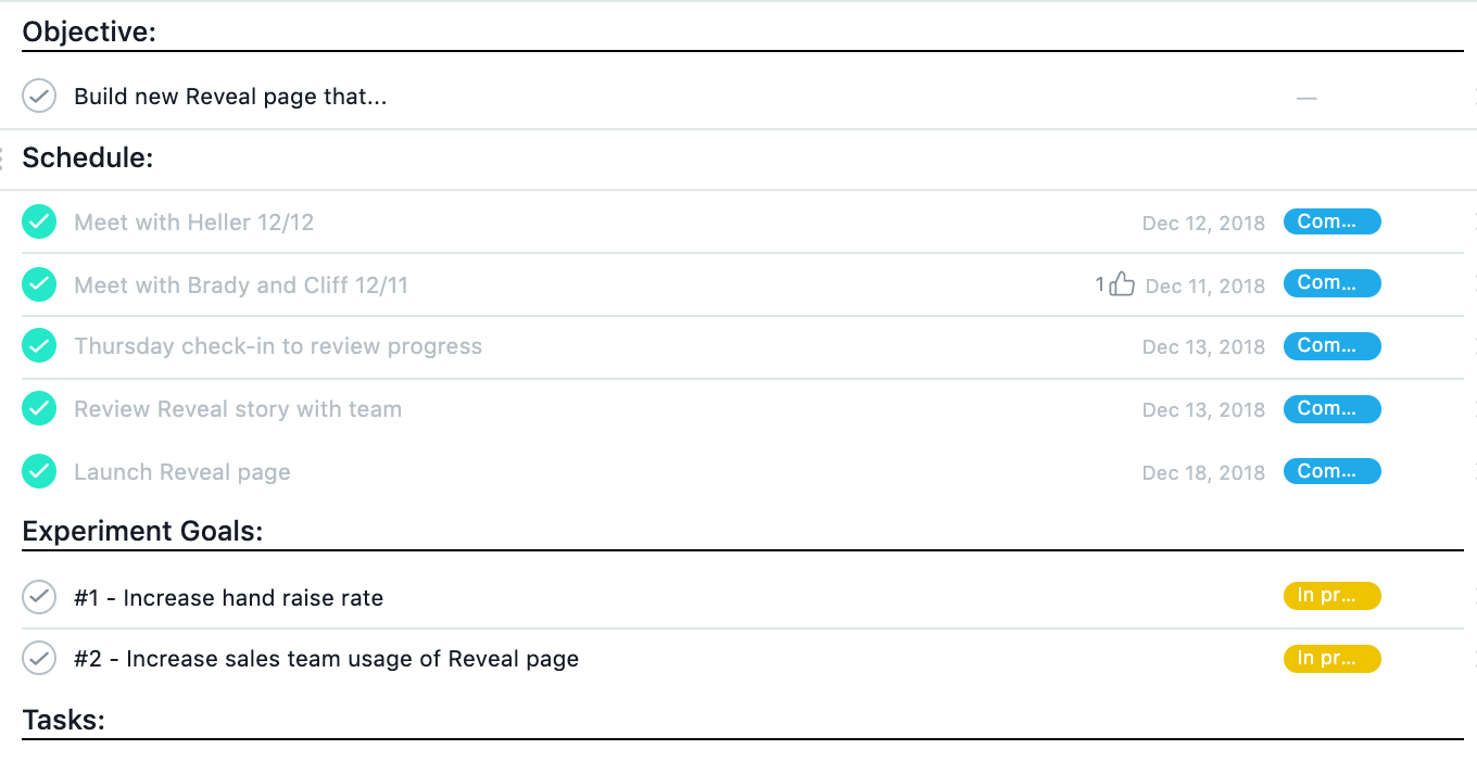
The first step was to improve our understanding of how prospects related to the Reveal product. Nick and I met with folks on the sales team to get more context about their calls and our audience. We captured notes in a shared Google doc so the rest of the team could see what we were learning and comment with feedback along the way.
These conversations were instrumental in showing what we needed to work towards in our redesign:
Lesson 1: Reveal isn’t a straightforward sell — its many use-cases are especially overwhelming when presented at once, as they also appeal to different buyers.
Improvement 1: Create a more compelling, guided "choose your own adventure" experience by: connecting use-cases more strongly with specific jobs and making specific recommendations to reduce choice paralysis.
Lesson 2: While many marketers want to tackle site personalization, sales was finding that they often required more concrete inspiration to get the ball rolling. Since many Reveal customers have joint go-to-market strategies for larger, high-ACV customers and freemium sign-ups — we could speak to the ability to direct each segment down a high-touch or low-touch path.
Improvement 2: Show the two possible personalization scenarios side-by-side, using very simple but powerful elements. We could highlight how you can change the headline and CTA to direct each segment down the appropriate path towards a self-serve signup (for small customers) or to talk to sales (for large/target accounts).
Lesson 3: The sales team was expending energy going through the page on a call in bits and pieces while trying to make a targeted pitch — but the whole product story could use some cohesion. How did the the disparate pieces all come together?
Improvement 3: We needed to tell a more coherent story upfront and let the use-cases arise from that narrative, rather than the other way around.
Once we had these insights, we brainstormed how to tell a coherent story about Reveal — something we could execute in words and visuals in a week — and landed on the theme of "signal versus noise". I started in on the website copy, Nick began creating designs, and Julie dug into metrics, establishing a baseline from the old demo page and setting our new goal. Meanwhile, Brian spun up a new page version with all the Reveal magic to show different content based on the visitor.
The new personalized Clearbit Reveal demo page
The finished product is a step up from the old demo page, with improvements to messaging, user experience, and examples. It, too, has dynamic context, using Reveal data to personalize the page as a demonstration of its own powers.
For example, if someone from Dropbox was visiting, the page would pull screenshots of the Dropbox homepage to show how Reveal could be used on their site.
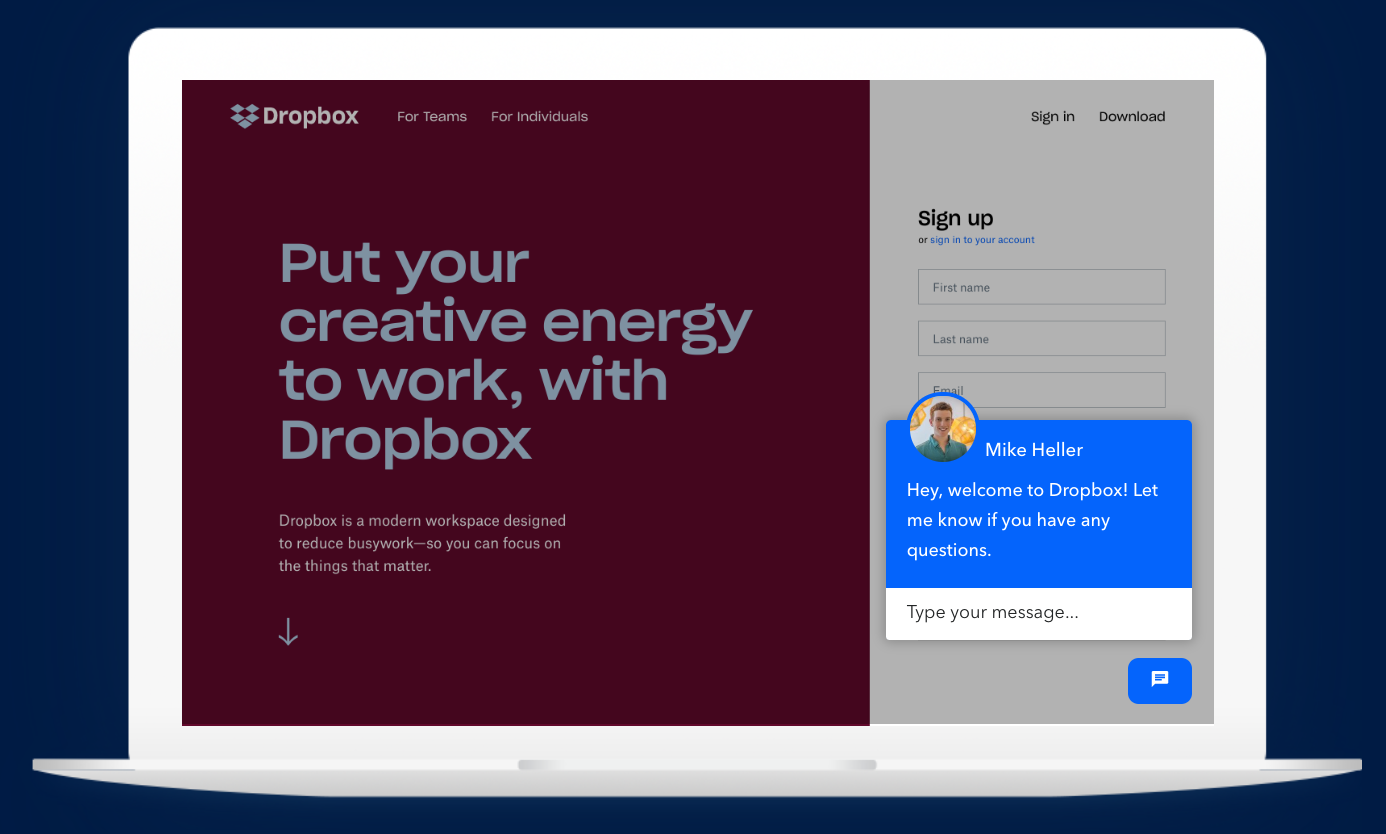 A section of the new Reveal demo page for a visitor from Dropbox showing chat personalization.
A visitor from Segment would see the Segment homepage, and so on.
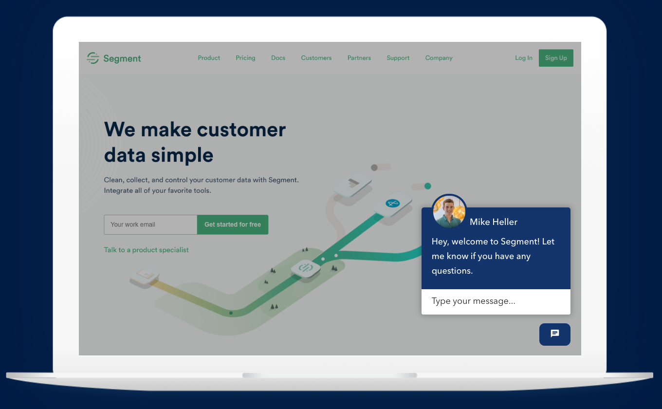 The same page shows the Segment homepage for a visitor from Segment
Here are three more examples of how we personalized the page.
Tailoring homepage content:
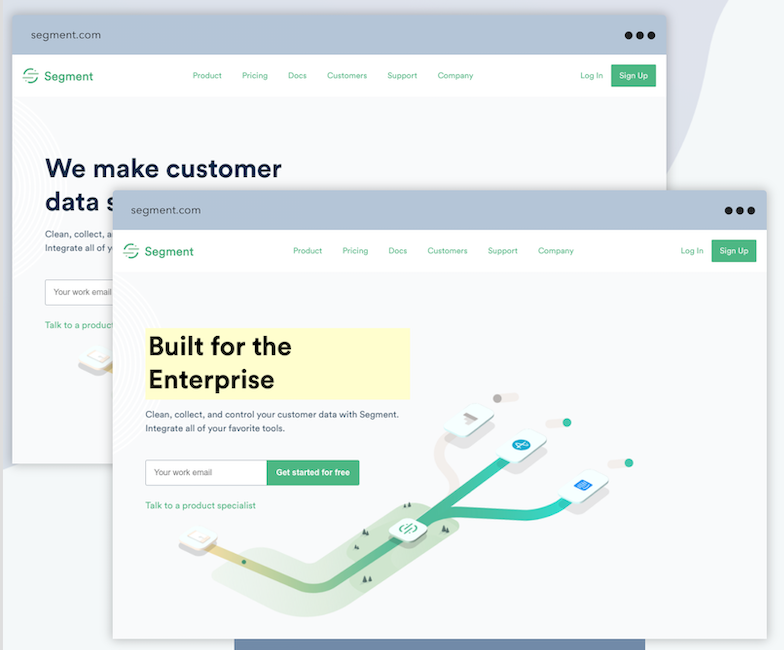
To demonstrate the capacity to personalize a web page with relevant logos, case studies, and other elements, the Reveal demo page pulls an image of the visitor’s company homepage, then shows two versions, including one featuring a sample customized headline.
For example, alongside Segment’s current homepage headline, "We make customer data simple", we also show a new version. The superimposed new headline — "Built for the enterprise" — shows how you could swap in a targeted message for enterprise visitors.
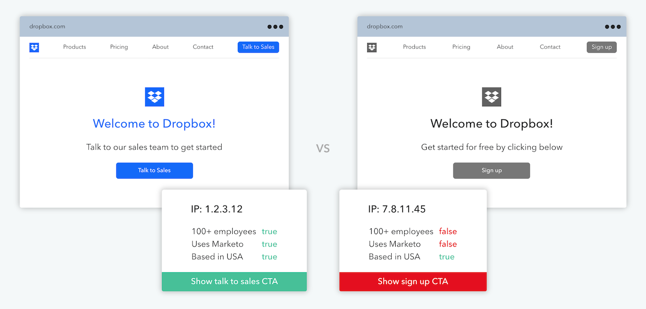
The demo page shows another side-by-side comparison for calls-to-action, based on certain company attributes. Visitors from companies that have more than 100 employees, use Marketo, and are based in the U.S. would see a CTA encouraging them to set up time with sales — while other visitors would get funneled into a free, self-serve account signup.
Alerting sales when a named or target account visits
The demo page illustrates how the Sales Alerts feature works by showing a sample notification: the visitor's company was browsing Clearbit’s homepage! With this kind of alert, sales can instantly see which accounts are interested and get contextual information (like employee count) to help prioritize their attention.
Recommending use-cases based on tech tools used
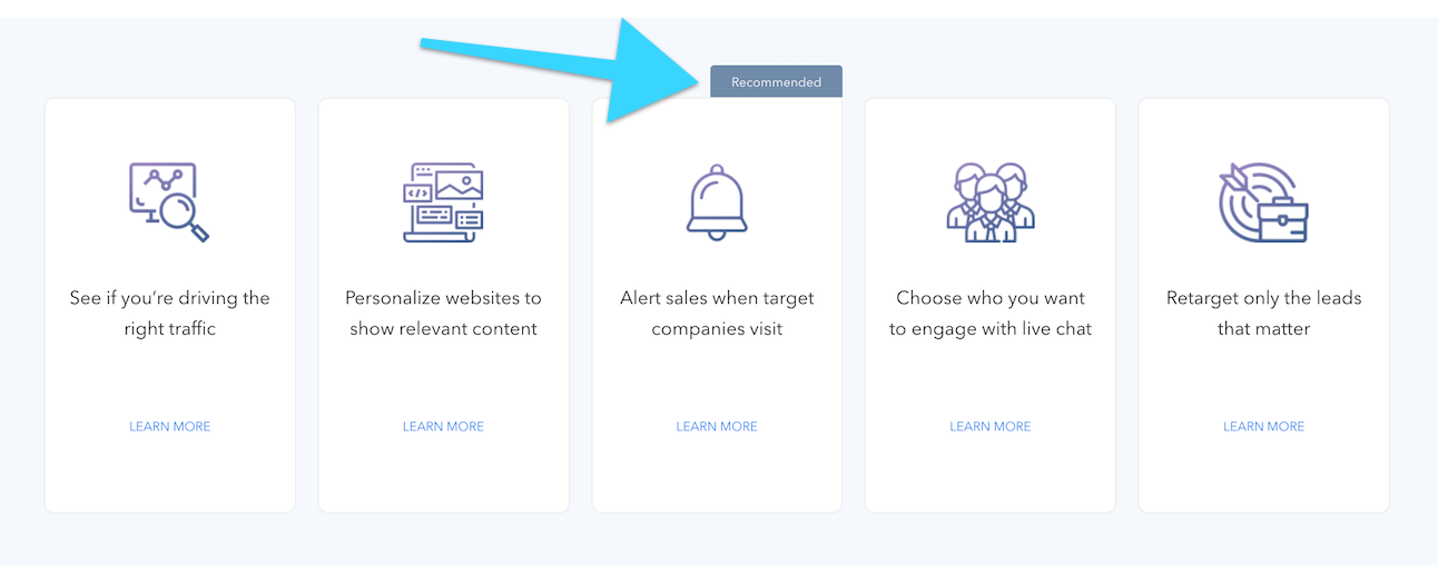
Using Reveal to detect the technologies that a visitor's company is using, the demo page can also recommend one (or more) of Reveal's use cases.
Results and takeaways
Once the page was built, we slowly began redirecting some traffic to it and soon found success!
We quickly hit the project target of doubling the page's hand raises. It generated a significant pipeline for our Reveal product, and about half of that pipeline has already closed.
Our experience with this hack week project underscored that when it comes to marketing our B2B products, we can show customers how to use our tools, not just tell them. We have access to great products, data, and expertise, so why not practice what we preach to create an interesting experience for prospects with personalization?
We also learned that personalization efforts can be meaningless if we just throw together a bunch of data points, no matter how thorough our coverage. We needed to understand our customers first to plan out how messaging will resonate and how data can best serve that plan.
The tips we got from sales helped with prioritization, as did the hack week format. By limiting ourselves to one week, we ensured that we didn’t overcomplicate the problem and got a working version out the door quickly. Most of marketing isn't a sure thing and it's useful to come together with this experimental mindset to test a hypothesis and open up paths to improve and grow in future iterations and projects.

