How to increase form conversion rates: A deep dive

[Updated] This post was originally published on December 4, 2020
Lead generation forms are a B2B marketer's bread and butter. Acquiring and moving leads across the funnel usually requires a full portfolio of them: contact forms, signup forms, webinar registrations, ebook download forms, demo requests, the list goes on. The problem is filling out web forms is annoying — enough that most of us won't return once we abandon one.
Nearly a decade ago, conversion optimizers started shortening web forms as research revealed that the fewer fields a form has, the better its conversion rates (like this HubSpot study of 40,000 forms in 2010, or Eloqua's analysis of 1,500 forms in 2011). By now, this is a convention of conversion optimization. Fewer fields, more submissions: the simple solution to boosting your form conversion rates like a marketing ninja/rockstar/unicorn/guru, right?
Of course it's more complicated. In practice, how you shorten forms matters.
Cutting the number of fields doesn't always increase form submissions. And marketers may still hesitate to cut off form fields, even if they do see higher conversion rates, because there's a business intelligence tradeoff. A shorter form, on its own, captures less data about leads — data needed for marketers and salespeople to communicate meaningfully with leads or qualify and route them in the first place.
So what's the solution? Enter dynamic forms, which shorten forms through automatic enrichment. This delivers the best of both worlds: business intelligence and just enough form fields for the best conversion rates.
Let's take a closer look at how sweepingly short forms can compromise your goals while dynamically-enriched forms optimize both conversion and user experience.
Shorter isn't always better for motivation
Aaron Brooks for VentureHarbor describes four cases of forms that perform better when they're longer, illustrating that: "There are too many factors involved in form design to simply turn around and say shorter or longer forms are more effective." Marketing isn't so simple.
One of the many factors to consider is customer motivation — why are they filling the form out in the first place? In one of Brooks's examples, a contact form's conversion rates dropped by 14% when conversion expert Michael Aagard cut it from 9 fields to 6.
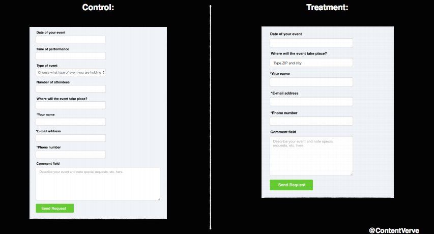 Before: Original 9-field form and After: New 6-field form (14% drop in conversion) [Image source]
Let's look at this form, where visitors could book an entertainer for an event. After streamlining the form, Aagard noticed that he'd cut some engaging questions about the party itself, like "type of event" and "time of performance," leaving more mundane or boring fields like "email address" and "phone number." Or as he puts it:
I removed all the fields that people actually want to interact with and only left the crappy ones they don't want to interact with.
Perhaps, he thought, removing those fields also removed the user's motivation to fill out the form. He restored the original 9 fields, but changed the explainer text for each one to provide some incentive to fill it out or made the field optional. He saw a 19% uplift in conversion without cutting the overall length.
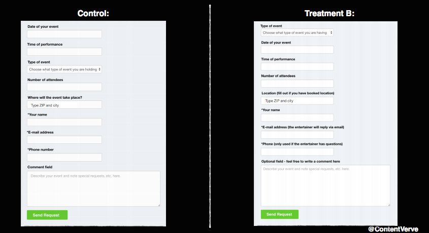 Before: Original 9-field form and After: New 9-field form with optimized order and text labels (19% uplift) [Image source]
Some of the specific changes:
- "Where will the event take place" became "Location (fill out if you have booked location)." Making the field optional reduced friction for people who hadn't nailed anything down — but for people who had set a location, it made sense that they'd want to share that information to get an entertainer that served their area.
- He moved "Type of event" to the first position, a fun question, compared to "Date."
- "Phone number" became "Phone number (only used if the entertainer has questions)", which provides a reason to share the information and confidence that they'll only be contacted to talk about party details that they haven't provided. It's no longer a generic request.
- The "Comment field" became optional as well, but provided space for someone further along in the planning process, or those interested in making a special request.
This form's new text gives the user confidence that it'll lead to a successful booking, with less back-and-forth. A bare-bones form requesting only contact information may feel more generic and a bit farther away from the customer's goal.
The psychology of form fields
Thinking about context and the user's motivation can help in designing a form that users will be happy to fill out, because it gets them closer to what they want from you. Adding more fields might make a form appear tougher to fill out, but the right type of field can more than make up for the loss.
Darius Contractor's Psych Framework is one way of looking at this idea. It describes how elements on a page can add or decrease emotional energy—and a user's "psych" to get through the process. Each element might have a value like +10 psych, or -5 psych.
In the event entertainer example, the new field labels and order added enough psych to increase conversions by 19%.
According to Contractor, B2B users tend to be high-intent and high-knowledge. They want to know what they're getting, so providing more information on a landing page or around fields may actually be a positive thing, rather than stripping away everything you can afford. Get inside your users' heads: what information do they need to see—and to share about themselves—to get closer to their goals? And what "boring" questions can you strip away, or answer for the customer using third-party data?
We'll look at some practical tips to increase psych on your forms using dynamic enrichment. But first, let's consider a technique called progressive profiling. It's a response to the form-shortening debate which works for some companies, but isn't always an ideal solution.
The pitfalls of progressive profiling
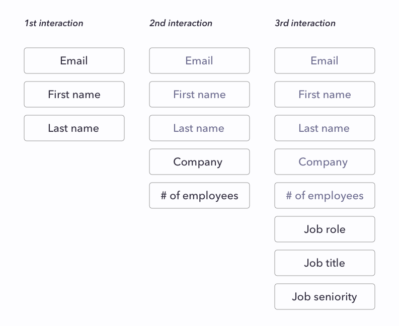
Marketing automation tools offer progressive profiling as a way to shorten forms while collecting useful lead data. This method breaks one long form into three, four, or more short forms to capture lead information over the course of weeks or months using "if/then" rules to fill in knowledge gaps.
A progressive profiling form might start by showing one very short form, like a name and email address capture on a landing page.
Once the lead is in the door, when they next express interest in a piece of content (like downloading an ebook), they'll see a new form fields that ask for a little more information, moving beyond the fields that they've already completed, which the CRM has already stored. As interest escalates and the lead moves down the funnel, the company captures more data about them.
Trying not to scare a lead away by asking too much at once may be useful in some scenarios, but here are a few concerns to consider when nurturing buyers, especially B2B prospects:
-
The B2B buyer's journey is rarely straightforward or even carried out by just one individual. What if a lead is ready to talk to sales when they first visit a website or multiple stakeholders from an account fill out forms at different times during their research and evaluation process? The marketing and sales teams won't get a full picture of the ready-to-buy lead and an inconsistent profile of the contacts on the account.
-
Leads may not interact with a company's content enough to move all the way through the process. Only 38% of buyers view more than four pieces of content from the vendor they ultimately choose, so it's easy to imagine people dropping off after just a few pieces of content.
-
Progressive profiling on its own, without appending data from a third party, still relies on the accuracy of the lead's self-report. It's just spaced out over time.
We advocate for shorter, dynamic forms with appended third-party data, so that a marketing or sales team has more information about a lead upfront and can act quickly if needed.
A better solution: dynamic forms
Short, dynamic forms save time by entering data that's already publicly available.
For example, here's how dynamic form shortening with Clearbit works: when a lead enters their company email address, Clearbit data automatically enriches it, filling out dozens of attributes (firmographic and demographic) in your CRM and marketing automation platform. Your lead is spared from having to do glorified data entry or filling out annoying fields just to get to a download.
This allows you to create shorter forms by removing fields where you already know the answers and dynamically asking for fields where you don't. Or, you can choose to show fields with auto-filled information reducing friction but giving people an opportunity to verify the information. Leads get fewer required fields and annoying dropdowns to deal with — and fewer chances to send you bad data.
Because Clearbit for Forms automatically provides lead intelligence, you can focus on better design and getting information that only the user can provide — like answers to questions that are important for sales conversations.
Bringing together everything we've discussed, here are some tips for building great forms of your own.
Tips for better form conversion
The overarching message is to consider the entire user experience and motivation to fill out your form:
1. Reduce fields with dynamic forms
Remove or autofill form fields that ask for information you can append yourself. For example, Bluecore uses form shortening to optimize email capture on a case study download for the automated retail marketing platform.
When Jane from Google enters her email — janedoe@google.com, say — and enrichment can fill in details based on that address — all Jane needs to do is confirm her country and she's done. Key firmographic and role information for Jane and Google populate her profile in Bluecore's marketing automation tool.
But if someone enters an email address like cats@gmail.com and there's no match, the form expands, adding three more fields for First Name, Last Name, and Company. Our cat friend will fill those in for us so that Bluecore still gets key information about their new lead.
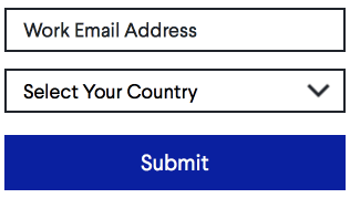 When data can be appended for the prospect
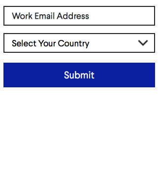 When enrichment can't identify the prospect
2. Don't cut motivating fields
Thinking back to the "Psych framework", add the most engaging, relevant, or valuable fields in the form. This might be "fun" information, as we saw in the party entertainer example. Or, it might be information you simply can't get from third-party enrichment. Here's an example:
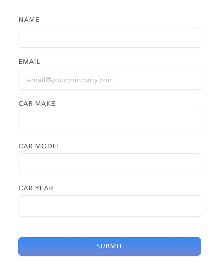
This is a form on a site where people can sell their car. Details about a car's make, model, and year is info that Clearbit can't find, but not including those fields would decrease psych; someone selling their car wants to provide this information because it brings them closer to their goal, and it's relatively easy for them to find.
Consider making them optional to reduce friction for people who can't answer at the time. With shorter, dynamic forms, you'll create an opportunity to ask more engaging, specific questions and increase the chances that people will fill out any optional fields.
3. Optimize your form messaging
Increase "psych" or motivation by conveying a clear value proposition in the headline and imagery around the form. Write engaging label text for each field that provides context for how the information will be used or how it'll get the user closer to their goal. Learn more about how to craft better microcopy.
4. Test your forms
Best practices for form optimization don't apply to every business. Test what works for yours, experiment with the number of form fields, and give the right amount of context.
Get more out of your forms with thoughtful design and strategically reducing or auto-filling fields. Get started with Clearbit for Forms today!!