Growth experiment #3: a quest for the least spammy exit intent popup on the internet

 Clearbit Growth Experiments: This series shares the process and results of our growth experiments — the good, the bad, and the ugly.
We’ve often wondered: why do exit intent popups still exist?
By their very nature, they’re one of the most annoying elements on the internet. Exit intent popups appear on your screen the moment you attempt to leave a website, as a last-ditch effort to get you to stay. They’re akin to going to a store, not finding anything relevant to your needs, and having a salesperson rough arm you at the door yelling, “WAIT! Are you SURE you don’t want to lose 50lbs in 3 days?!”
And yet– these metaphorical screaming salesperson tactics survive because they allegedly work. Neil Patel cites a 1,375% boost when using them to convert newsletter subscribers.
At Clearbit, we were more interested in using them to convert meaningful leads. Specifically, we wanted to convert visitors from our Ideal Customer Profile (ICP) into demo requests– our first step of the buyer’s journey.
Design-wise, we challenged ourselves to blend effectiveness with delightful UX. We wondered: could personalizing an exit intent popup fare better?
Hypothesis
Our objective was to create an exit intent popup that helped us book more demo requests from target ICP visitors. As with most problems we encounter, we believe that a personalized experience always blends effectiveness with superior user experience– visitors feel seen and uniquely desired.
We predicted this to be a low-lift task yielding a 2% conversion rate of ICP visitors to demo requests.
Experiment design
Design-wise, we wanted a popup that ticked two boxes:
- Catch visitors’ attention in a delightful way (haha, clearly we enjoy a challenge)
- Resonate with ICP visitors through effective copy
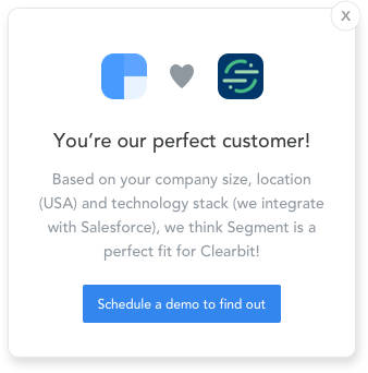
What better way to delight and engage prospective customers than by showcasing our own product? We settled on a campaign concept of “You’re our perfect customer” which uses Clearbit attributes (specifically company logo, company size, and tech stack) pulled via Clearbit Reveal to make an ICP visitor feel like an ideal match for our product.
We ran two iterations.
The first version was, let’s say, not created by a professional designer. ;) We personalized the visitor’s logo, and wrote generic copy letting them know that based on their unique attributes, they were a perfect fit for us. The CTA button led to an SDR’s Calendly page for immediate demo scheduling; we also cookied visitors and made sure they only saw messages from the same SDR.
 left: footer with logos for funded SaaS companies; right: footer with logos for enterprise B2B companies
After running this for 3 months with minimal effect (more on that in the Results section), we redesigned the modal:
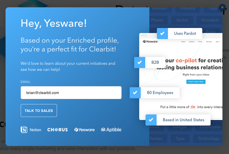 Taking another crack at our exit intent popup
In version 2, everything on the right-hand side–the visitor’s homepage, industry, size, location, tech stack–was personalized.
According to Ethan Hackett, Senior Conversion Designer, the second modal took a “show don’t tell” approach to encapsulating the power of Clearbit Reveal: the targeting, attributes, and attention-grabbing delight that comes with a personalized interaction.
“We really wanted to drive home the point that with Clearbit Reveal, you can get all this [company] data about your visitors and create unique, relevant experiences. You could say all those things with words but showing them is so much more powerful.”
We also updated the CTA copy to a more human ‘Talk to Sales.'
In terms of mechanics, we chose not to surface this popup to every single visitor of our site to reduce the spaminess factor. After all, we only wanted to schedule demos with potential customers that would yield the greatest benefit from our product (and selfishly, the greatest Lifetime Value for us). Plus we didn’t want to waste our sales team’s time giving demos to low-quality leads.
Thus we only triggered the popup when a visitor was on our site for at least 30 seconds (industry best practice calls for at least 20 seconds) and met key attributes. We also capped the number of times a visitor would ever see this popup to five.
Results
As hinted above, version 1 was Dead On Arrival. It received zero requests for demos. Design aside, we believe this was because it wasn’t shown often enough due to lag on the backend–we were querying our Redshift account, which was so slow that visitors were exiting our site before we could even trigger the popup! We could’ve used Salesforce’s API but that would’ve required a lot of manual labor, and the initial results weren’t promising enough to justify the effort.
The messaging was non-user centric; it listed our reasons for why a user was a perfect customer for us, and nothing about why we were a perfect product for them.
Version 2 saw a 13.4% conversion rate.💥 For this version we used our own products to give us real-time ability to unmask anonymous traffic and filter high-fit accounts from webiste visitors. From there, we triggered the popup after 30 seconds of time on page.
Furthermore, where the popup appeared mattered greatly. Our best-performing landing page by a moonshot was /pricing, followed by /plans. This was expected given the high intent of these landing pages, and the data validated this:
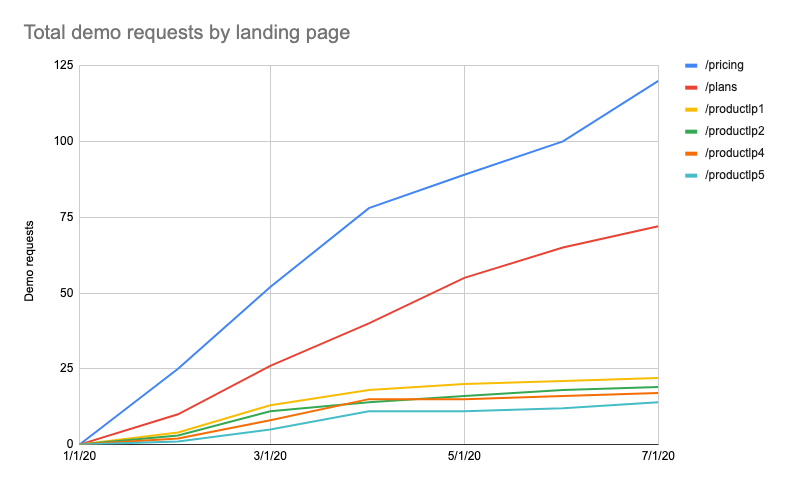 Our exit intent popup converted best on high-intent pages like Pricing and Plans
Learnings
-
Reduce your spam factor by showing popups on high-intent pages. As the previous graph shows, popups on high-intent pages greatly outperform the rest. This was a welcome reminder that it’s important to treat high-intent pages–like /pricing and /plans–differently, and to not spam visitors who are just passively browsing.
-
Relevant messaging cuts through the noise. Version 2’s message was “as 1:1 as you can get through automation,” Ethan notes. From the attention-grabbing visitor’s homepage to showcasing their unique attributes, more than half the popup was personalized, compared to just 5% of version 1.
-
Real-time setup matters. We launched version 1 when some of our data systems weren’t as fast as they are today. Companies can’t afford to not have a smooth data system that can trigger activities in real time.
By keeping relevance and respect for our visitors in mind, we think we found the least spammy exit intent popup on the internet.
“People’s spam filters are so high these days that you really have to do something unique to stand out. Personalization lets you break through that filter. At least, it makes people pause,” says Ethan.
That's great, but what if I don't have Clearbit?
Use whatever personalization capabilities you have with some of the key learnings above. Another thing to consider is using exit intent popups for things other than a newsletter signup (which we think is overdone in B2B SaaS).
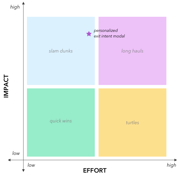
Effort-impact scorecard
We expected to put in medium effort for medium return — hoping to bring in more demo requests every month — and found the impact of Version 2 better than expected!
EFFORT: Medium
IMPACT: High

Shout out to Brian, Ethan, and Julie who ran and measured this experiment.