Chapter 5
20 minutes
Customer Onboarding

Ty Magnin Senior Director of Brand Marketing at Vendr
Onboarding matters in B2B SaaS marketing. We all know this. The way you introduce new users to your product can significantly increase the chances that they’ll activate, make their first purchase, and stick around as high-LTV customers.
And luckily, there are excellent resources in the community to help companies design a great experience, from welcome emails to product tutorials and more.
But many of them gloss over or ignore an important point: an optimal onboarding experience often requires tailoring to different audiences.
As a SaaS product scales, its user base is more likely to exhibit a wide range of needs. In the B2B world especially, SaaS customers come from different industries, company sizes, and pre-established workflows. Sales teams recognize the variations and assign them to different verticals and high-touch or low-touch service levels, which affects how much customer service, how many phone calls, and what type of email outreach new clients get. Why shouldn’t onboarding do the same?
A little personalization and segmentation go a long way toward helping a user hit their first successful action and beyond.
In this chapter, you’ll learn how growth marketers at three SaaS companies, Canva, AdRoll, and CloudApp, have used data and personalization to optimize their customer onboarding process for different user needs, improving conversion rates and customer retention.
Our protagonists have shared their actual in-app notifications and emails from their optimized onboarding strategy so you can see them in action. What underpins their success is a shared culture of systematic experimentation to learn what uniquely works for their company’s customers. Best practices are helpful, but they only go so far.
For our first story, we learn about Canva’s growth playbook.
How Canva changes their first product experience based on user intent
Xingyi Ho, a growth manager at Canva, follows a team process to run onboarding experiments and improve activation rates.
For background, Canva is a graphic design tool that has raised $42 million (as of September 2016), and boasts Guy Kawasaki as its chief evangelist. Users can easily create blog graphics, cards, collages, posters, and more.
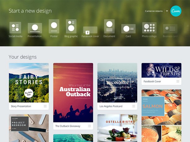
As Canva gained traction in both B2C and B2B markets, it built a growth team to not only get more signups, but also to improve the product’s activation rate. For the growth team, “activation” comes after a new user signs up for an account, and it’s tracked as the percentage of new users who successfully published a design after signing up.
To improve activations, signups, and more, the team uses a growth playbook, which outlines a typical experimentation process. Applied to the initial onboarding experience, the team can test small tweaks and find quick wins before rolling them out permanently. Then they “rinse and repeat,” making testing a core part of their work.
And it’s highly effective. In aggregate, their early set of activation experiments have boosted their activation rate by 10% to 12%. These improvements translate to tens of thousands of additional users finding value in the product every month.
Let’s take a look at one of these typical experimentation loops, in which Xingyi improved activation rates on one part of the product by 10%. For this one, he was helping users who were looking to create posters with Canva.
The story starts with the search for spots in the onboarding experience that were ripe for improvement. Xingyi first looked at the volume of all of Canva’s acquisition and activation channels using Canva’s product data tool, Amplitude. “If an acquisition channel only contributes to about 5% of our signups, we probably won’t pay too much attention to it,” says Xingyi, “but if a channel contributes to 20% to 30% of signups, that’s where a big opportunity might be.”
He searched for channels that got high traffic but had low activation rates after the signup process, and zeroed in on the webpage for Canva’s poster feature.
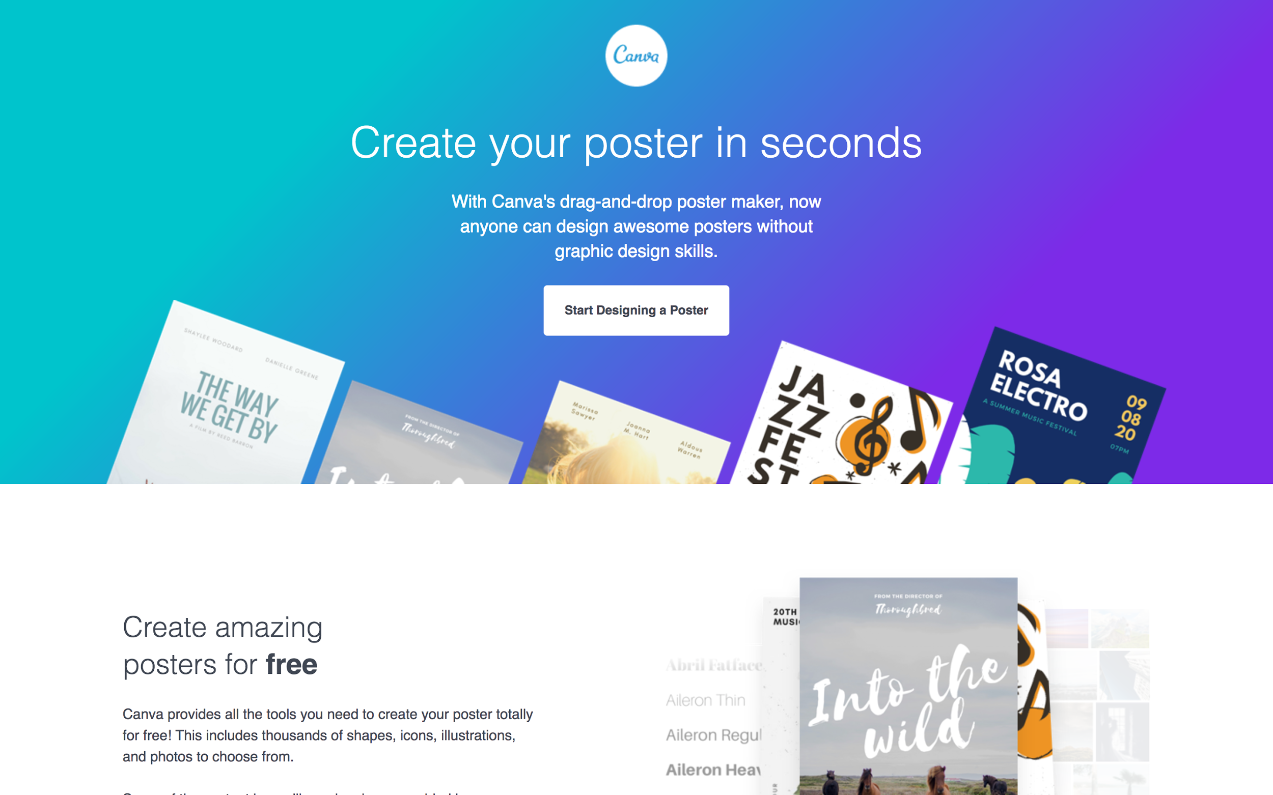
A sizeable percentage of users who signed up on that page would not go on to create a poster.
Why? And what could be done about it?
Xingyi first went into research mode to understand why some people stopped in their tracks after signing up. He ran a user experience test as a sanity check to see whether there was anything obviously confusing or misaligned in the user onboarding experience. When they didn’t find any snags, he moved on to surveys to help him find more hidden reasons for why people might not be creating posters.
Xingyi emailed a one-time survey to churned users to better understand why they churned. The survey questions were inspired by Avinash Kaushik of Occam’s Razor, who suggested asking the following questions to churned users.
- What is the purpose of your visit to our website today?
- Were you able to complete your task today?
- If you were not able to complete your task today, why not?
It revealed that many of the 500 respondents simply didn’t find what they were looking for when they tried to create a design in Canva after signing up. He pocketed that insight.
Then, he implemented an automatic email to be sent to new users almost immediately after signup. It contained a short survey to figure out the users’ goals—in other words, the “job to be done.”
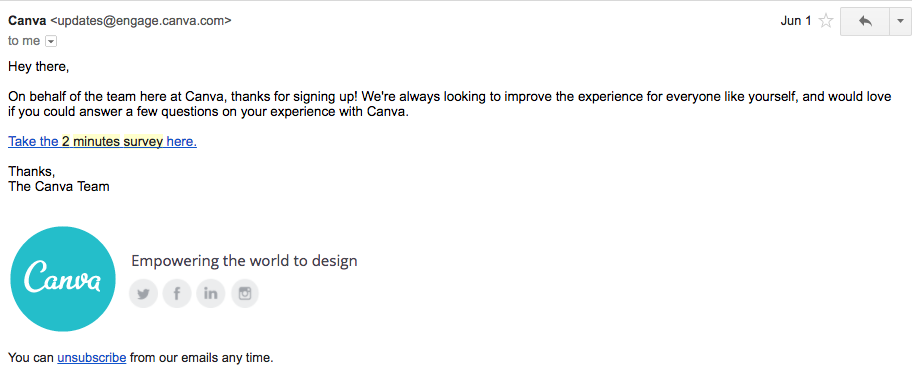
Looking at the patterns of the responses that came in, Xingyi realized that the goals of new users were vastly different. Some were coming to create a poster for their church, while others were doing it for a rock concert. The clip art, stock photos, and tools these users needed may not overlap. That may have been why some visitors didn’t find what they were looking for. Faced with a sea of unfamiliar options, the rock-concert-poster-maker would lose momentum and abandon.
“If they sign up to create a poster, we want to know what type,” says Xingyi. “Is the poster for a church event or a rock concert?” If they had this signal, they could show the right templates and images to get them started.
Xingyi knew he was on the right track by changing the onboarding experience: a previous analysis of internal product data showed that “When users want to create a design, they usually create the design on the first day,” he says. “After the first day, anything we do will have a comparatively lower impact.”
This led to the hypothesis Xingyi would go on to test: personalizing the onboarding experience based on intent around poster creation would improve activation rates.
He took the survey results and tallied the types of posters people wanted to create; the six most popular ones were Event, Retail, Music, Fundraising, Holiday, and Advertising.
Testing the hypothesis
One quick way to figure out what kind of poster a new user wanted to create, without implementing a complicated tracking system that followed their Google search query, was to simply ask them. So Xingyi created an interstitial to appear in the Canva onboarding experience.
Since he didn’t want to tap into engineering resources to try it, he used Appcues to run a small test for a percentage of users pitted against a control. Here’s what that user experience looked like on Canva using Appcues.
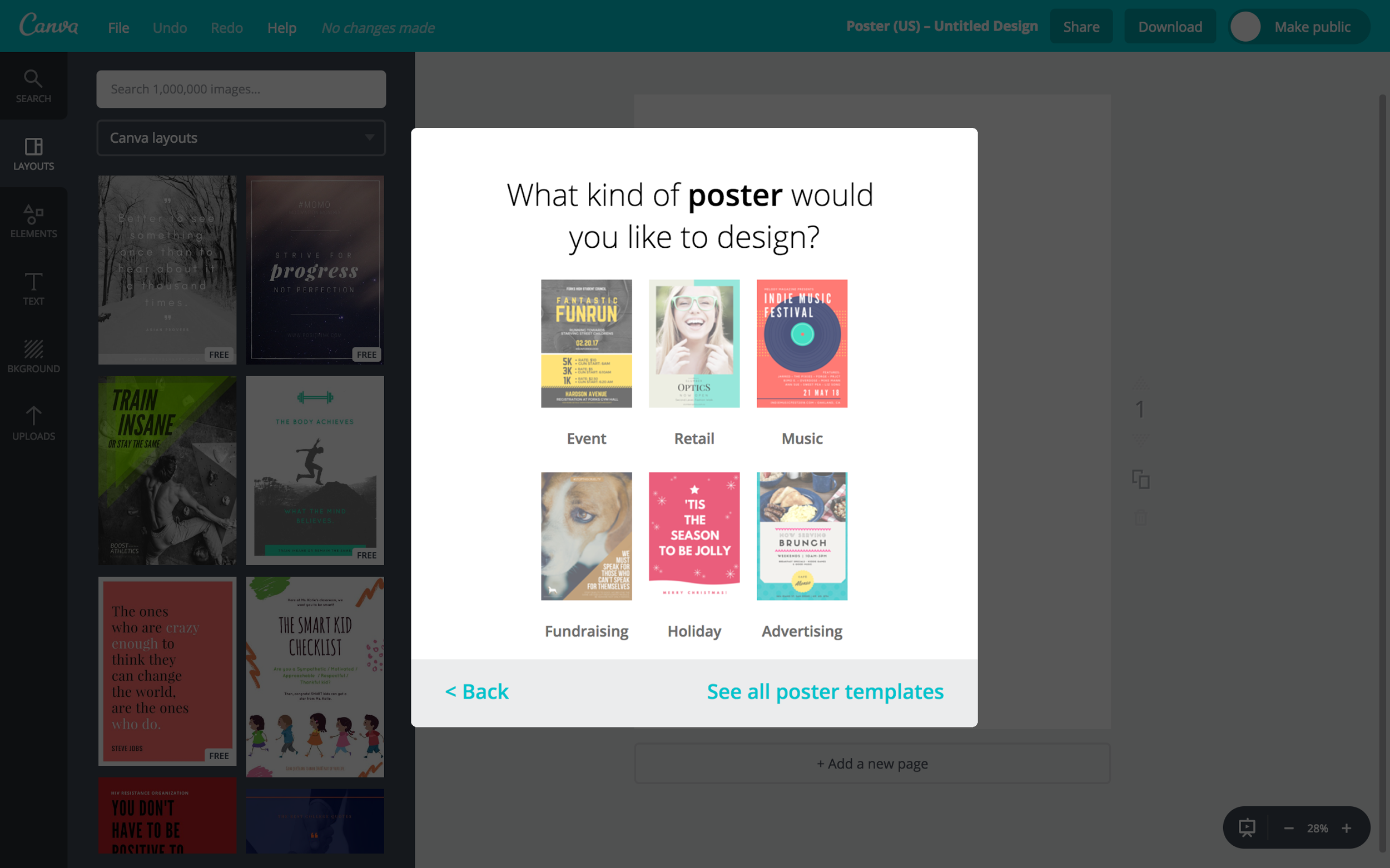
Based on what a user selected, Canva would route to a different experience that highlighted thematically appropriate images and templates.
After two to three weeks, statistically significant results appeared in Amplitude. He found that, indeed, the tailored onboarding experience worked better, with a 10% increase in activation for the posters product.
When Xingyi and his growth team get positive results like these, they do three things next.
First, they refine. They’ll run a few more experiments to squeeze a bit more value from the finding. “We try to find very small opportunities for optimization. That could be testing different types of thumbnails in our Appcues message, the copy, or the design.”
Then, they roll it out 100%. After running experiments in Appcues and getting a large enough impact, they’ll roll out a change to 100% of users. This often involves engineers hard-coding the experience into the product.
Finally, they extend the hypothesis to other features and products. The personalized onboarding hypothesis has since been tested in Canva for Work (their B2B product), their cards feature, and the onboarding experience from the Canva homepage, which is their largest acquisition source.
Once a hypothesis has been validated and extended, they start from the top, look for the next low-hanging fruit, and run the same experimentation playbook. Canva’s growth team has conducted 30 to 50 of these initial experiments, using the following process.
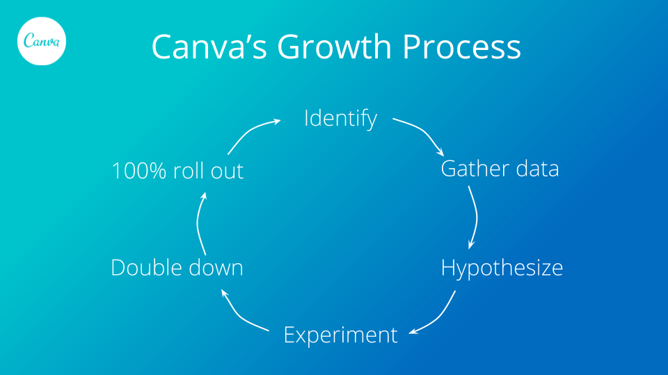
Steps in Canva’s growth process:
- Identify the opportunity. Xingyi looked at product data and saw that the posters acquisition channel had high traffic but low activation. That’s what opportunity looks like.
- Gather data. Xingyi ran several surveys, looked for patterns in the data, and quantified jobs to be done.
- Hypothesize. Based on the patterns, he thought an onboarding experience tailored to a user’s desired “type of poster” would improve activation.
- Experiment and measure results. He ran a three-week interstitial test in Appcues and saw a 10% lift in activation.
- Double down. He refined the interface and poster options with more tests.
- 100% roll out. The product and engineering team hard-coded the interstitial into a permanent part of Canva’s product.
With the cycle now complete, Xingyi and the growth team will start over again, looking for new opportunities to improve activation.
Next, let’s take a look at onboarding experiments from the growth team at AdRoll, where they have a similar playbook, where they repeat cycles of tests and double down on what works in other areas of the business.
How AdRoll encourages integrations by automatically segmenting new signups
Remember Max Blaha from AdRoll’s growth team in Chapter 1, where he shared his tips for retention emails? We’re having him back to tell us about his most successful onboarding experiments.
As a reminder, AdRoll is a self-service advertising platform that helps companies retarget and prospect customers with ads across web, mobile, and social media. (They’ve raised $90M in venture capital since they were founded in 2006.)
Onboarding is a key growth lever for AdRoll, on par with retention and feature adoption as focus areas for Max’s growth team.
And they have a very specific metric for a successful onboard: getting the user to spend their first $1 on the platform. The more new users Max can convert into paying customers, the more room the company has to grow.
Max knew that integrating AdRoll with other marketing software made it much more likely that a user would start spending with AdRoll, so he focused his experiments on improving integration rates.
The platform offers integrations with popular marketing, email, CRM, and ecommerce tools such as MailChimp, Zapier, Shopify, HubSpot, and Marketo. For example, a new AdRoll user who already uses MailChimp can connect to Mailchimp through AdRoll. They’ve worked hard on building and segmenting email lists, so why not use those lists to do better ad targeting in AdRoll? Similarly, a user who also has Shopify can connect it to AdRoll and retarget people who’ve abandoned their shopping carts.
It’s easy to see how an integration makes AdRoll more powerful and useful for the user down the line. Max confirmed this hunch by running regressions across raw product behavioral data exported from Amplitude, showing that enabling integrations correlated with customer success.
Integrating also helps new users get off the ground faster. “By integrating AdRoll with other platforms, users can target their audience faster and more effectively. It’s an essential part of getting set up,” says Max.
It takes just a couple of minutes to click to connect, sign in, and authenticate the accounts. Customers just need a little prodding.
Max tested a personalized loop to nudge people along the integration path. His existing onboarding flow was a one-size-fits-all experience, so Max tested a personalized, automated loop to nudge people toward integrations.
He started by encouraging MailChimp integration via email and in-app notifications. A MailChimp-focused message shouldn’t go to all of AdRoll’s new customers, only the ones who also used MailChimp. (That would be confusing.) So he needed to isolate the right people.
Finding the right audience
Max and his team set up this flow to automatically find MailChimp enabled folks as new users created AdRoll accounts.
- As people sign up for AdRoll and enter their email addresses to create accounts, the address is sent to a third-party data provider, Clearbit, which enriches the user record. Its company tech tags represent the technology stack used by a company, and they flag the users that have MailChimp accounts.
- Next, internal data flags and excludes accounts that have already integrated AdRoll with MailChimp. No need to send a redundant message.
- Segment sends the user records to Customer.io for targeted emails and to Appcues for targeted in-app messages.
This flow happens automatically as soon as a new user signs up for AdRoll, with Segment tying all the tools together.
Sending nudges
Max set up the emails and in-app notifications to encourage a user to integrate with MailChimp, making sure the messaging was specific to that platform and set of user needs.
It included:
- Copy about the value and benefit of integrating
- A call-to-action to integrate now
- MailChimp logo and a graphic for MailChimp+AdRoll (which he created with a designer)
Then he tested it out, setting the emails and in-app messages to appear 15 days after signup to catch any folks who didn’t integrate during their first two weeks of using AdRoll. Here’s a look at what the in-app modal looked like in Appcues.
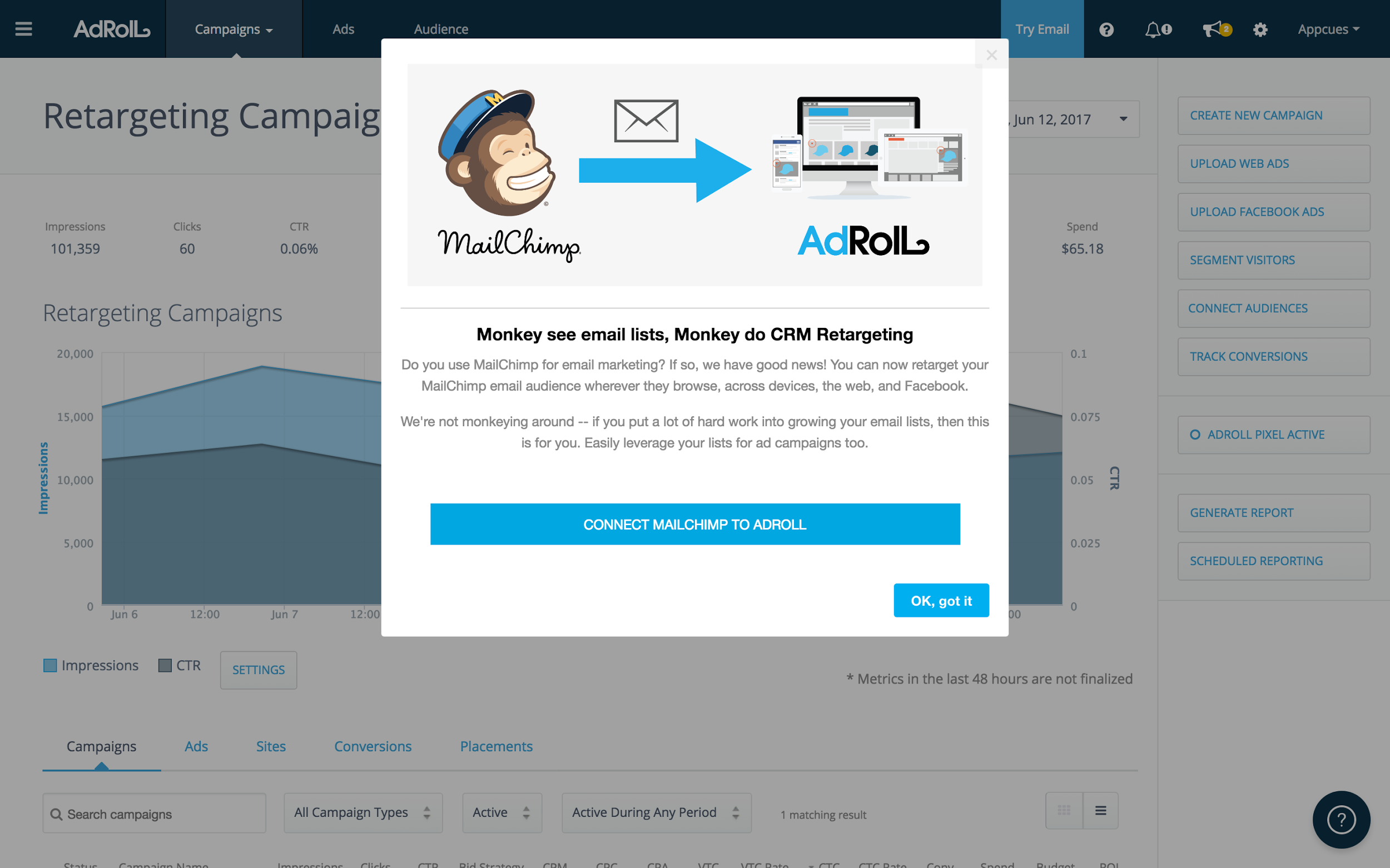
The copy reads: “Do you use MailChimp for email marketing? If so, we have good news! You can now retarget your MailChimp email audience wherever they browse, across devices, the web, and Facebook.” It goes on to point out that the user put a lot of hard work into their email lists, so why not use them for ad campaigns too? Now that’s a convincing value prop. The call-to-action is “Connect Mailchimp to AdRoll,” with an opt-out.
20% of the people who saw the in-app message went on to integrate. “This kind of adoption was unprecedented,” Max says. “It’s a crazy-high adoption rate, even when compared to email or account manager outreach.”
Within two weeks, the number of people who had integrated MailChimp doubled, from about 400 to 800 integrated accounts. Five or six months later, the percentage of people who integrated Mailchimp multiplied 5x.
Repeating the playbook
“When something works, we’re going to do more of it.” Max went on to create emails and in-app messages for every integration, making sure to highlight individual value props. Here are examples of the HubSpot and Marketo integrations.
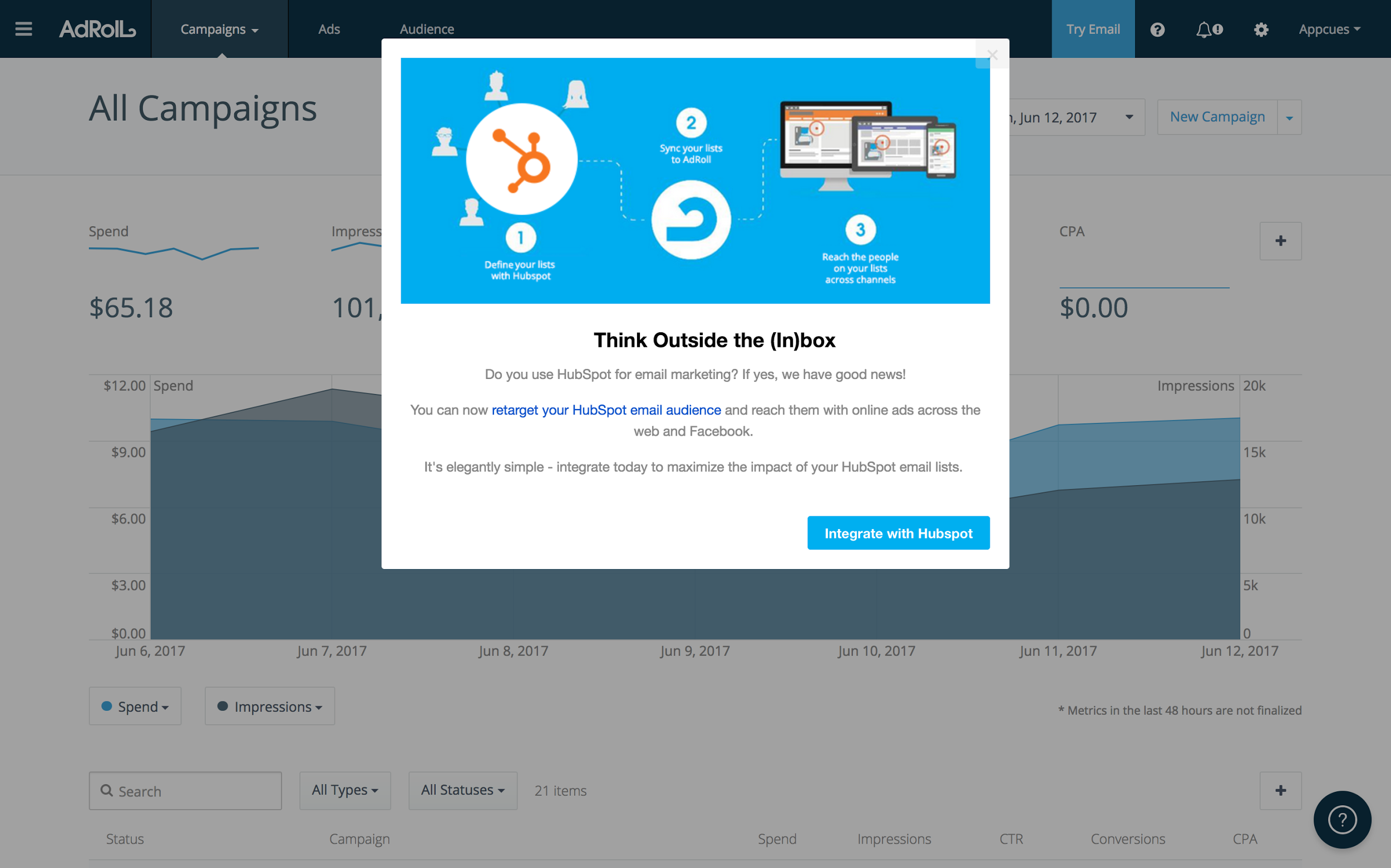
Modal for HubSpot and AdRoll integration. Value prop: “You can now retarget your HubSpot email audience and reach them with online ads across the web and Facebook.”
Across all integrations, the average goal completion rate remains around 20%, although some do better than others.
Iterate to improve
It’s important to keep experimenting and improving on what works. Max started testing alternate form factors. Here’s a pop-up to notify people of newly available integrations.
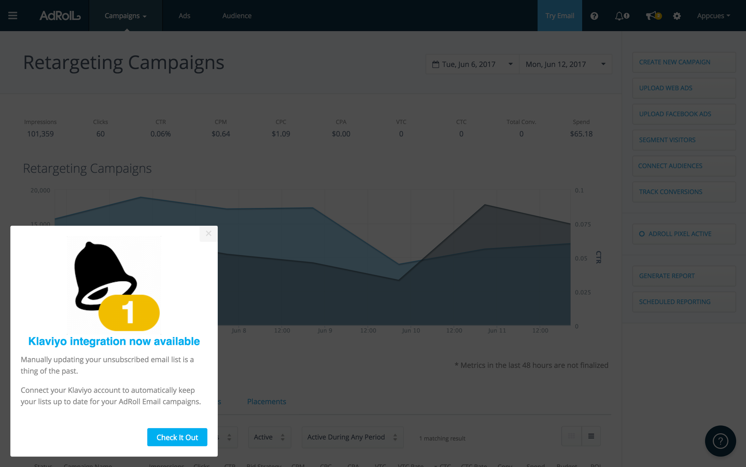
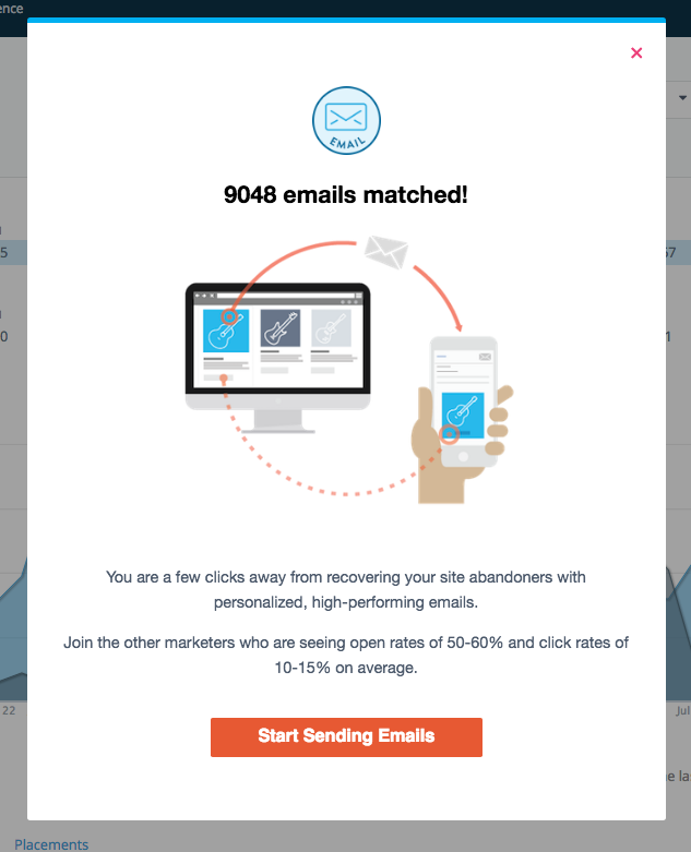
They’re also experimenting with more advanced personalization, like dynamically adding a new customer’s company logo into the in-app notification and email, or highlighting that company’s platform statistics. In the email below, they highlight a company’s open rates and click rates, and suggest that they follow in the footsteps of companies with similar benchmarks.
So what can we learn from AdRoll when it comes to data-driven onboarding?
Use third-party data to learn about the customer in the wild (such as what software they already use), then personalize your messages to them accordingly, which lets you be direct about the benefits and call-to-action for their specific situation. “The more personalized an onboarding experience, the more effective it is,” Max found.
When you find something that works, repeat it. And always keep experimenting.
How CloudApp sends helpful, automated, personalized emails to get new users started
When Scott Smith, CloudApp’s VP of Sales and all-around good guy, first turned his focus to his user onboarding emails, he had no real direction to follow. Considering that his version-one onboarding emails basically all just said “here are three things to do, let me know if you want a demo,” his emails have come a long way.
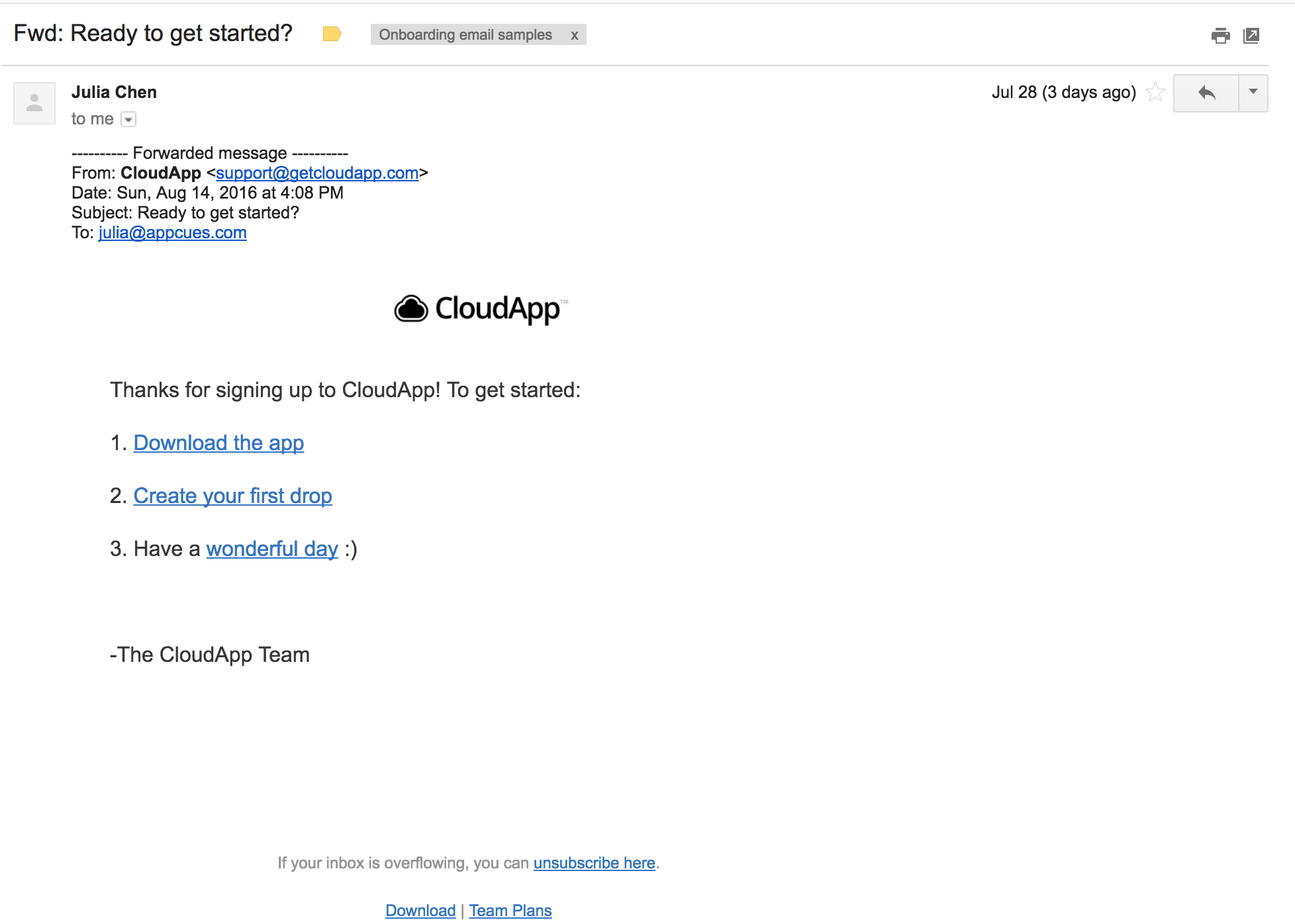
CloudApp’s onboarding emails now have layers of data manipulation in order to prioritize and personalize each outreach. This helps them automate part of the sales process for users that only need a self-service product, which reduces overhead while scaling their small team of two people (they act more like a team of ten).
Scott didn’t build it all overnight. He talked to marketer friends, read blog posts, and listened to users who responded to his onboarding emails to improve each one. Through the process, Scott added layers of complexity, from machine learning to Clearbit data, all over the course of 13 months. But far from feeling robotic, the emails are so well personalized that they continue to get warm responses. “We’re seeing growth in our email replies from people who feel the outreach is real, not automated,” says Scott. All this contributes to faster onboarding with fewer complications for the sales team.
Getting users past the #1 onboarding milestone
The first and only thing Scott and the CloudApp team care about for new users is that they download their desktop app. That’s the basis of their product, and without the desktop app, people can’t truly use the product.
So they use a series of emails—five, to be exact—to push people to install. CloudApp’s app data lives in Segment, which tells Customer.io which users have not yet installed the desktop version. Customer.io then triggers the email series, stopping it when a user installs.
Here’s an example of an early message in the series. The first call-to-action is “Download the app.”
Evaluating the likelihood of buying
After a user installs the CloudApp desktop app, CloudApp helps them discover features and use the product. The more active they are, the more likely they are to upgrade to the paid product.
So the overarching onboarding flow passes through three phases:
- Get users to install the desktop app.
- Help them use the tool and discover free features.
- Talk to them about the features they’d get with the paid version.
CloudApp has a sales team that can talk to leads about whether upgrading is right for them. But to keep the team lean and effective, they should really be talking only to qualified leads, such as people who could get their team at work into a CloudApp team plan. Scott set up a way to qualify users and route them into different onboarding experiences with different amounts of sales and support attention.
MadKudu, a machine learning tool, scores CloudApp’s new users automatically. MadKudu first evaluates CloudApp’s successful customers and then looks for look-a-likes among new users, based on in-app behavior and Clearbit firmographic data like job title, company industry, and company size. Then they score each new user and put them into tiers that indicate how likely they are to become successful customers.
This score is pushed from MadKudu back into Segment, where Scott assigns users to segments that will receive different targeted emails.
Users who qualify as “likely to buy” will get emails from a CloudApp account manager offering demos. This makes sure the sales team doesn’t get unqualified appointments on their calendar and helps them stay lean. Here’s an example of a short, warm introductory email in the onboarding series from a sales teammate, Kat.
Users who don’t qualify get similar emails, but from the customer support team and without the offer of a demo. These users are often people who signed up with a Gmail or a iCloud account, indicating that they’re individual and not business users, or without associated Clearbit profiles. The emails are structured templates that immediately help a user self-serve and get started on their own, rather than striking up a conversation like the sales emails do.
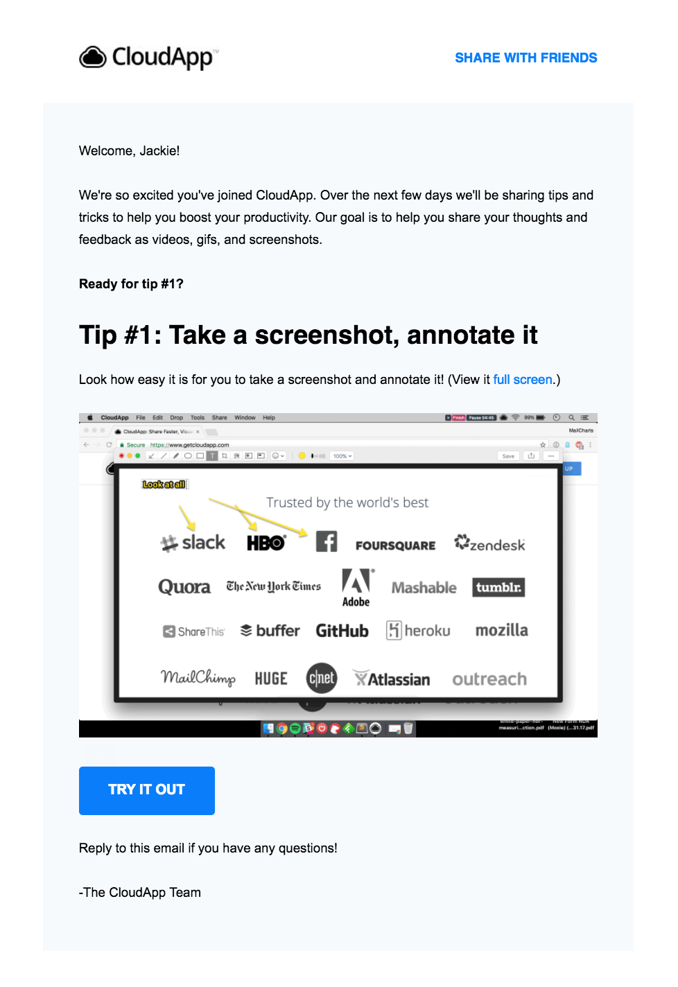
Over the next few days, the user will continue to receive tips in the series.
Give users dynamic help
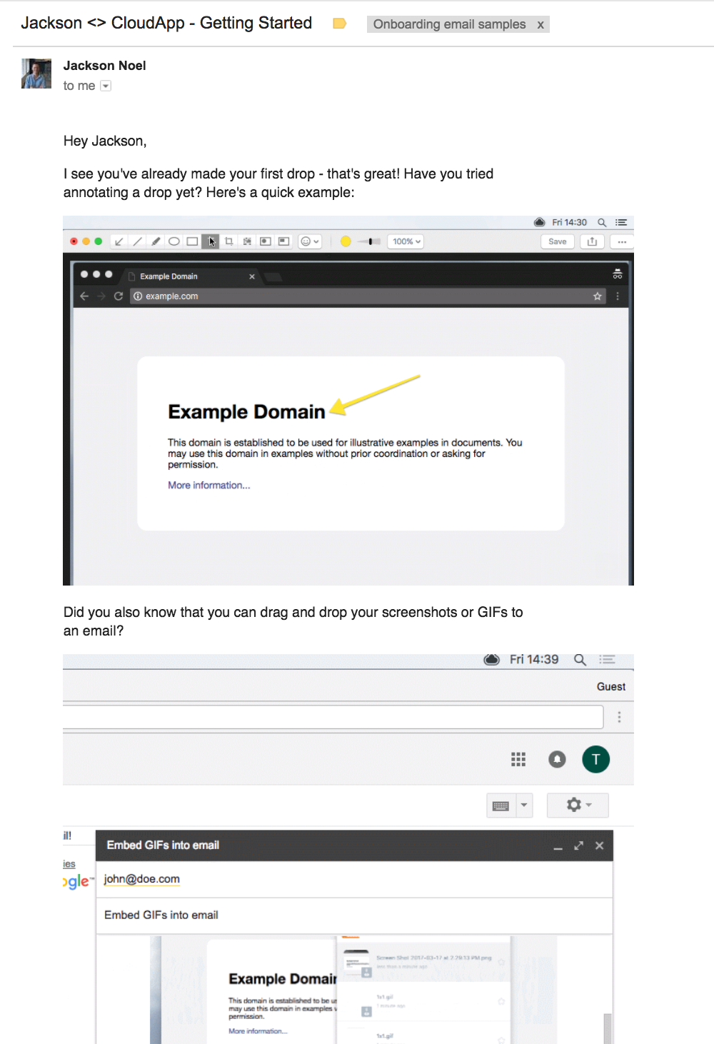
Sometimes, users got “stuck” during onboarding in the sense that they stopped short of trying certain CloudApp features. Scott implemented emails that are triggered in Customer.io based on what events a user has done and hasn’t done, and helps them try a specific feature or reach a certain milestone, moving them along the funnel.
Here’s an example of an email that pushes users onward from their first CloudApp “drop” to the next step: annotating an image.
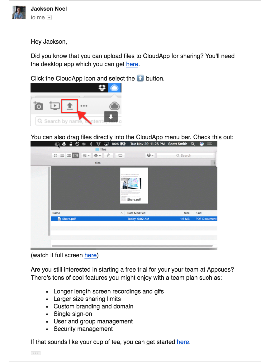
In the next example, the email shows the user how to upload files to CloudApp for sharing.
These emails were slightly different, depending on whether the user was a self-serve account or a sales-qualified account. For example, this outreach email references the user’s potential difficulty in adopting a new tool into their workflow.
Other emails would ask if sales-qualified leads wanted to sign up for a team plan. This example is automatically personalized for the recipient, referencing the “3 people” at their company who are already using CloudApp.
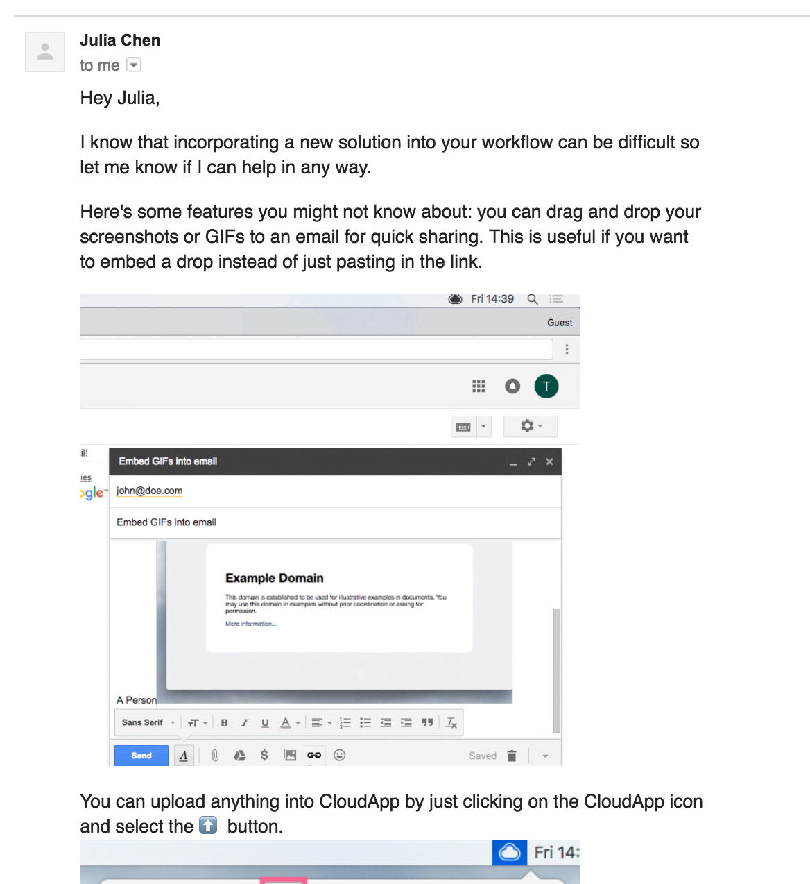
These emails were an effective way to automatically help people get the most out of CloudApp without sending their whole product documentation to everyone at once.
Winning back expired trial users
All of CloudApp’s paid plans offered a 14-day free trial window, and CloudApp encouraged trial users to upgrade to a full-time, paid plan before the two weeks were up. But looking at MadKudu data, Scott saw that 50% of CloudApp’s paid users had converted after their trial had ended.
He realized then that it was just as important and fruitful to communicate with users about upgrading after they had technically “churned” from the trial. He immediately set up a series of three automated emails with a casual tone to win them back.
These were triggered based on the “trialExpired” event in Customer.io. Here’s an example of one of the later notes in the series.
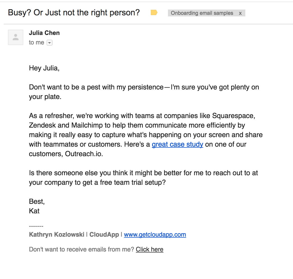
“Now, when I look at the number of responses per day that Kat receives, it’s substantially higher because of these winback emails,” says Scott. “We now see pre-expiration and post-expiration as part of the same pipeline.”
What can we learn from CloudApp, AdRoll, and Canva?
When you design or improve your own onboarding experience, take a step back and check whether there are any obvious ways you can segment new user groups. How can you meet their unique needs? Can you customize the way you communicate with them?
If you’ve checked those major boxes, it might be time to break out an experimentation playbook to find hidden personalization opportunities. What areas of your product experience have high traffic numbers but show low activation—or other indicators of “stuck?” Moving users through those hurdles might mean offering a different helping hand from one person to the next.
But the beautiful thing about the data-driven approach is that once you’ve set up this customization, it’s automated. Your marketing systems scale so your support and sales teams don’t have to. Happy onboarding!
