The biggest mistakes businesses make when building their online forms

This is a guest post written by Alun Lucas, the Managing Director of Zuko Analytics.
Forms are the sharp end of your website, the tipping point where your potential customer is about to click submit and give you their contact or payment details. Get your forms wrong and you’ll lose out on those potential customers.
At Zuko Analytics we’re experts when it comes to form conversion. We process data for thousands of forms every year so we see what works and, just as importantly, what doesn’t. In this article, we share 10 of the biggest mistakes businesses make when designing and implementing their online forms. Steer clear of these and you’ll be starting your form design process from a good place.
10 Forms mistakes (jump ahead)
1. Planning from the businesses’ perspective (not the user)
2. Not optimizing for mobile devices
3. Not managing expectations
4. Using dropdowns (for long lists)
5. Asking the most difficult questions first
6. Using unhelpful error messages
7. Forcing users to confirm password
8. Not explaining why you need information
9. Being too restrictive with input stipulations
10. Not using inline validation
1. Planning from the businesses’ perspective (not the user)
We start with a big-picture point. When you sit down to plan out your form, the more departments you include in your planning the longer your form will be. . Marketers want demographic information, Compliance wants financial information, and Operations need contextual information for things like lead scoring and routing.. This mish-mash of requirements is one of the biggest reasons that some forms end up as a dog's breakfast — requesting too much information makes users decide to give it a pass.
Although having a large number of fields in your form will not necessarily affect conversion rate, including fields that the user deems are irrelevant certainly will. This is why you should ideally be using technology that shortens the form when certain questions are not necessary for every visitor. Either way, you should start from the principle of designing for the user - only ask the minimum number of questions needed to successfully (and legally) deliver your service.
2. Not optimizing for mobile devices
With over half of internet users connecting via a mobile device, it is highly likely that a significant proportion of your form visitors will be using a mobile. The user experience on a 5-inch phone screen is very different from a 21-inch monitor so you’d better make sure that your form adapts well to a mobile environment.
Specific tips on this include:
- Use responsive design and make sure you check legibility. Don’t just port your webform over from the desktop version and hope for the best. If you’ve ever attempted to fill in a desktop form on mobile and tried to tap on the input boxes with your fingers you know what we’re talking about. Responsive design will format the fields to render well on the smaller format.
- Utilize native phone attributes. A mobile device has a number of features that a desktop computer or laptop doesn’t. If you can use a camera or scanner to improve the user experience then do so. Allowing them to take a picture of a driver's license rather than having to tap in the relevant reference numbers will improve things significantly.
- Be careful of processing speeds. Connection speeds can vary on mobile devices. Couple this with lower processing power (compared to desktop) and you have a recipe for a slow, unresponsive form. Take account of the slower speeds; remove bandwidth-hungry images from your forms and stay away from any video or animations.
3. Not managing expectations
If you are asking for anything reasonably complex from your form users - think passport details, driver's license, income / financial information - you better tell them this at the start of the process. If they only learn midway through completing the form they need these details there’s a good chance they’ll have to leave your form to try and find that information. They might never come back.
If, instead, you tell them upfront what they need they can get everything together before embarking on their form journey.
4. Using dropdowns (for long lists)
In most cases, dropdowns are a sub-optimal format for user experience. Eye tracking research shows how they cause users to pogo up and down the form, distracting them from the task at hand. The format is even worse in the smaller viewport of mobile devices and the longer the list, the worse the experience.
We've all had the frustration of having to scroll down an interminable list of countries to find the correct one like in this example below:
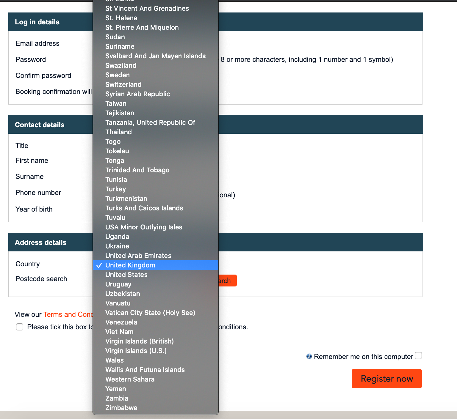
If you find yourself adding a dropdown to your form, always consider whether a text box, radio button, or checkbox would deliver a better user experience. At the very least, make sure that your dropdown is searchable so the user can type in the correct answer rather than having to scroll down a huge list.
5. Asking the most difficult questions first
Would you go up to someone in the street and ask them to give you their personal financial details? Of course not. In real life, you get to know someone first before divulging into personal details.
The same principle applies to forms. If you ease the user in with simple questions to start, you gain their trust and, through the psychological consistency principle, make it more likely they’ll answer those more difficult questions later in the form.
6. Using unhelpful error messages
As sure as eggs is eggs, your potential customers will make mistakes on your online forms. When that happens, it is your duty to gently guide them to change their input to something acceptable. Big red error messages are stressful enough for the user without showing them something as unhelpful as this example:

When creating your error messages it is important to follow these principles:
- Indicate the error clearly. Be specific what the problem is (for example “You have not used the @ sign in your email address”), and make sure the message displays immediately next to, or under, the offending field. Don’t place it right at the top or bottom of the screen. The user needs to see it immediately.
- Be helpful. Tell them what they need to do to fix it. Don’t use jargon or technical language. Your forms should have a tone as friendly as your customer support representatives.
- Don’t blame them. Use passive language rather than accusative. “Your username and login do not match'' is better than “You have entered an incorrect username or password”.
7. Forcing users to confirm password
Research shows that Password is consistently the most problematic field for users. Don’t make it twice as difficult by insisting they enter it a second time. We are not in the 1990s anymore —users aren’t accessing your website at an internet cafe with prying eyes everywhere.
The reason for asking for confirmation is to minimize the volume of forgotten passwords in the future but the confirm password case studies suggest the improvement in conversion rate will far outweigh that issue.
8. Not explaining why you need information
People really don’t like handing over information if they are not sure what you will do with it. Baymard Institute research indicated that not providing a reason for wanting a user’s phone number was a major factor in them abandoning forms. Unless you tell them otherwise, users assume the worst and worry about being bombarded with sales calls.
A simple solution is to add microcopy explaining why you need that information and what you will do with it. This example from firebox.com shows that when it is done well, this method is unobtrusive and very effective at reassuring users.

9. Being too restrictive with input stipulations
Users have their own way of storing information in their heads and if the format you insist upon in your form clashes with that there will be trouble. The classic example is the Phone Number field which can be rendered in dozens of different ways. Do you allow spaces? What about dashes or parentheses? Do they need to enter the country code? If so, do they need to add a ‘+’?
The potential for frustration and confusion is endless. If you are overstrict on validating the users’ input, a significant proportion of them will not enter it as you stipulate (this study indicates that 89% of users won’t enter the answer in the format you specify). This leads to unnecessary abandonment and lost business.
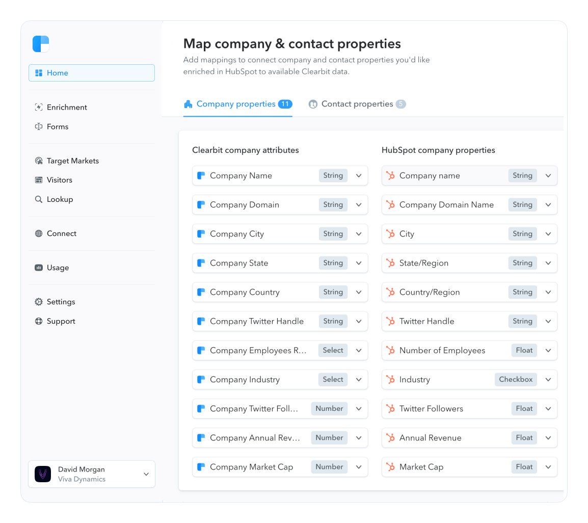
It’s much better to be looser in your validation and reformat the data at the back end into the structure you need. Or you can turn to tools like Clearbit Enrichment to provide data like phone number, company size, and more so you don’t have to ask questions that require complicated formatting in the first place. Always make it simpler for the user where possible.
10. Not using inline validation
Inline validation (showing messages immediately after a user has completed a field) is one of the more powerful tools you can use to improve your form conversion. Historic studies showed an average 22% uplift in successful form completions. If you are not using it on your forms you are missing a trick.
An example of well-executed inline validation in action:

If you are looking to improve the performance of your forms then using Clearbit and Zuko in tandem can be very effective. Zuko data can show you exactly where the user issues are on your form and Clearbit for Forms can help you optimize your conversion rate by shortening your forms without sacrificing data.